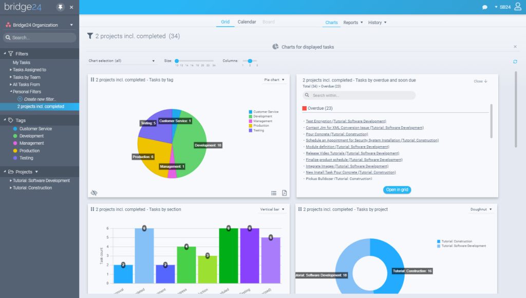
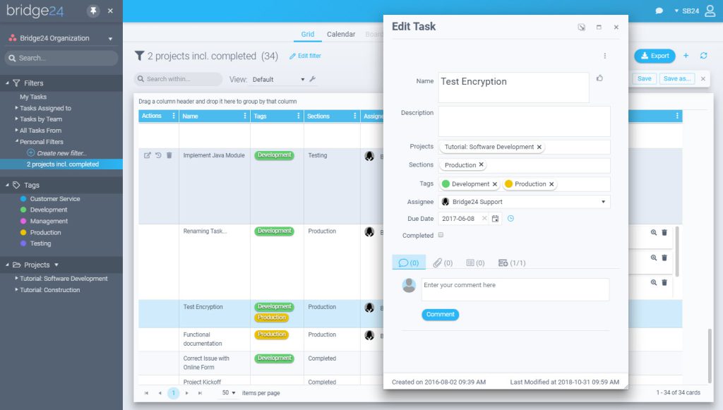
Opening the Bridge24 interface today, you will have noticed a complete visual revamp. A number of technology components were updated recently and we took the opportunity to also freshen up the interface with a new color scheme and style to enhance the readability and clarity of the application.
Enhancement included:
- New contrasting to increase the usability for new users
- Notifications are less intrusive
- Quicker load times for dialogues
- New type font and sizes for better readability
In case you haven’t opened the app today, here is a quick look:


We hope this new interface allows you to work more productively using Bridge24!
Leave A Comment