 Basecamp project management and team communication software helps its users organize their project tasks, documents, and communications in a central workspace. Most customers report having a better handle on their business after bringing their work in Basecamp. Other benefits of having a centrally organized project management application are increased project visibility and team accountability. Also, teams can launch their projects faster, but with fewer meetings. For a great extension to Basecamp, we recommend you use our own tool Bridge24 for Basecamp.
A Unified Hey! Inbox
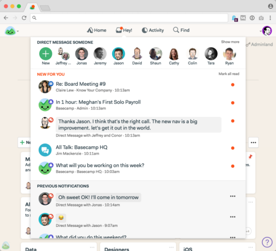
Last mid-December 2017, the company announced a visual refresh to make the application easier to use. One of the first major changes centered on the simplification of the navigation bar. From 7 items on the menu, it was reduced to 4, namely: Home, Hey!, Activity, and Find. Under the Hey! menu, users will also find their Pings direct messages and Campfires chat rooms. And as previously, users can find their posts, comments, assignments, check-ins, and @mentions there also.
![]()
The result was a single unified inbox. Aside from the fewer menus, some terms were also changed. At the top of the Hey! The screen is a row of faces or profile pictures where a user can send a private/direct message. They previously called it a ping. Below the Direct Messages, the section is a “New for you” section that shows new direct messages, new comments, new posts, and other unread communication. After reading a new communication item, it goes down further below the screen under the heading “Previous notifications.” So, all types of communication are under a single menu.

The Return of the Pings
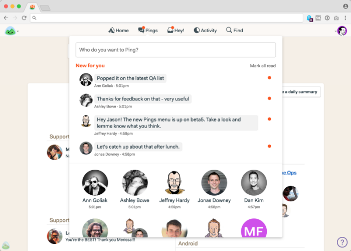
However, after a day or so, the Basecamp team decided to bring the Pings menu out of Hey! Also, the term “Pings” was back instead of private/direct messages. It seems that after the first phase of the refresh went live, customer feedback was loud and clear enough asking for a separate Pings menu. People use pings when they are trying to directly communicate and get hold of another person. Placing it under another layer of menu was not helpful. Thus, the Pings menu once more has its own place in the nav bar, being a separate category of notification.

Basecamp 3 Refresh
The Basecamp team apologized for what they call overstepping in their effort to simplify and remove clutter. They still believe that they can add functionality and clarity while making the application feel simpler for users old and new. In fact, while restoring the Pings menu back, they were able to improve the screen with a new feature. Now, it includes previews of the last lines that others have sent the user.
The next phase of the refresh continues. A broad overhaul of many important screens are underway. However, the Basecamp team will do it carefully so as not to disorient customers who are in the middle of their projects. And because it is a refresh, not a redesign, things will be familiar enough. The reason for the refresh is due to new ideas, for a cleaner interface, and for a more enjoyable and approachable user experience. For more information about the latest announcements and other new features, check out Basecamp on Twitter, Facebook, Instagram or YouTube.
Leave A Comment