 Basecamp started in 1999, and since then went through a few transformations. Today, it is on its version 3, and it continues to provide users all the tools that their teams need for project management and collaboration. Recently, the Basecamp team announced that they will be rolling out some visual refinements over the next few months. Their aim is to minimize the complexities that have build up over time. They believe they can add power and clarity while making the app feel simpler and more approachable to users. In fact, Phase 1 redesign is now live. For a great extension to Basecamp, we recommend you use our own tool Bridge24 for Basecamp.
New Simplified Navigation
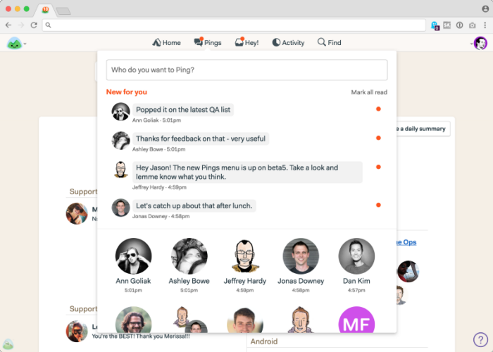
The first visual refresh in Basecamp 3 is centered around simplified global navigation at the top of the screen. Now, there are only 5 menu items on top: Home, Pings, Hey!, Activity, and Find. On the initial launch, the Pings menu was consolidated into and fell under Hey! However, they brought it out back, because customers felt it is a separate category of notification. Therefore, it should have its own special place in the navbar, and now it’s back. Also, the new Pings menu includes previews of the last line that a user has sent.


Unified Hey! Inbox
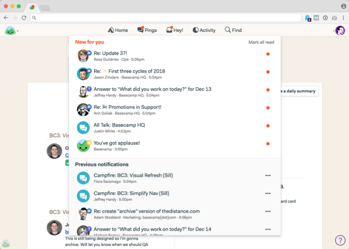
Under Hey!, users can find their posts, comments, to-do assignments, automatic check-ins, @mentions, and Campfire group chat rooms. So, if they want to see any of these, there is only one place to look. There is a “New for you” block where all new notifications flow into. Also, Campfires now show who posted the last chat. Below this block is the “Previous notifications.” Once a user has read a notification, it goes down into this section. A link at the bottom will allow them to see all previous notifications, which are all kept safe and still accessible.

Single Reports and Activity Screen
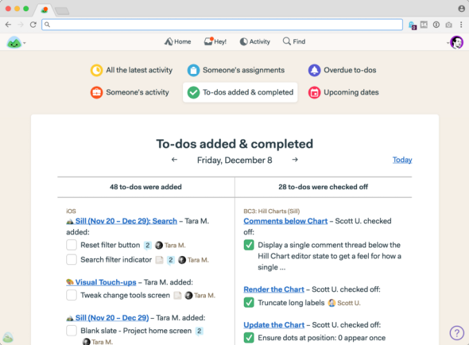
The redesign in Basecamp 3 Phase 1 includes the consolidation of the Report menu into a single Reports and Activity screen. Reports are now at the front of this page, and at the top of the Activity screen. Several buttons are available to see a different report. For example, clicking the button “Someone’s assignments” allows the project manager or team leader to see what are that user’s to-dos and workload. The “To-dos added & completed” button shows the total number of tasks added and checked-off for that particular day.

Phase 2 Preview
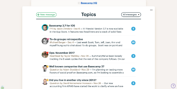
Now that Basecamp 3 Phase 1 redesign is live, Phase 2 will be coming shortly. The focus of the second phase is about overhauling key screens. However, they will do it carefully, so as not to disorient users who are in the middle of important projects. Some of these areas will include home pages, message boards, to-do lists, and automatic check-ins, to name a few. There will also be additional tweaks to navigation, new typography and better use of space. There will be fewer elements on each screen, better proportions, a new background, and more consistent placement of buttons.

To learn more about these new features and upcoming redesign announcements, visit also their Twitter, Facebook, Instagram or YouTube page.
Leave A Comment