 Basecamp solves many business communication problems by keeping everyone on the same page. The online software has helped thousands of companies get a better handle on their business. Projects get off the ground faster when teams are collaborating more and communicating efficiently. It has web and desktop versions, but also works on mobile devices. A couple of months ago, it announced screen improvements on Hey!, the go-to screen for all communication and notifications, on its Android app. For a great reporting and exporting tool for Basecamp, we recommend you use our own tool Bridge24 for Basecamp.
New Hey! Screen in Basecamp 3 for Android
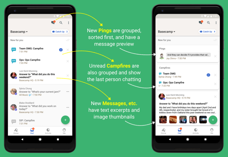
A new Hey! screen design became available starting with Basecamp 3 for Android v3.9.1 last May. The goal of the design was to help users catch up easily using their Android devices. The web and desktop versions are already very good, so people on the go should have a similar experience. Since Hey! is the tool that helps them prioritize, it is only logical to start there. Now, teams can see excerpts on their Pings and messages, Campfire chats are grouped together, and image previews provide more information at a glance.
Improvements in Detail
Before, people check the notification icon to know if they have unread Pings and how many. But aside from that, its a complete mystery what they are all about. Also, its harder to follow Campfire chats and know who gave the last comment. With the new design, the Hey! screen provides more information in less time, so the user can decide quickly what to do next. In detail, the following are the improvements:
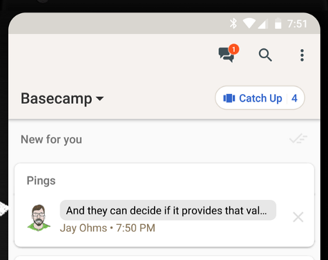
Pings on Top
The latest Basecamp 3 for Android now displays unread Ping conversations on top. If users have more than one conversation, it will be grouped and sorted. Thus, they need to check only one place to see all their Pings. At the same time, all Pings are still accessible on the top navigation.
Campfires Grouped Together
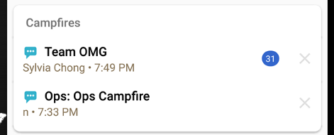
The Hey! Improvement also groups together all new Campfire chats. It will be easy to scan all the chats the user is following. Moreover, the notification displays the last person chatting. This feature matches what is available on the web and desktop versions.
In Context
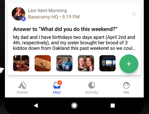
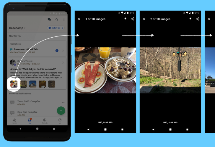
Previously, users can be guessing about the unread notifications they see on the app. Now, excerpt of text and image thumbnails dispel the mystery in the latest Basecamp 3 for Android. They can see if that notification is just a single emoji, or a sentence, or a paragraph. Teams can see on the onset without having to tap and spend more time to know more.
Swipe Through Multiple Images
Included in this version is a bonus feature that updates the image viewer. If a message or comment has multiple images, users can easily swipe back and forth between the multiple images. Furthermore, if any image includes a caption, that will show up, too.
New Design, Improved Usability
The latest Basecamp 3 for Android improves further the ability of the software to hold communications among users in a more efficient way. It provides context to unread notifications that previously leaves them wondering. They can easily decide from the excerpts and image previews if these need immediate attention or not. They can prioritize which Campfire chat they want to read. Now, they can stay on the loop without even having to tap the notifications. In short, they will know exactly what is going in less time than usual.
To learn more about the latest mobile app features and other product updates, check Basecamp also on their Twitter, Facebook, Instagram or YouTube page.
Leave A Comment