 Basecamp online software for project management and team communication helps people work in one organized place. Although work nowadays is not necessarily confined in one room or office, users can still keep everyone on the same page with the help of its native apps on mobile devices. The PM software is ready whenever and wherever they are. In fact, the latest release 3.9 for iOS devices is providing improved usability features, especially for team members on the go. For a great reporting and exporting tool for Basecamp, we recommend you use our own tool Bridge24 for Basecamp.
Improved Find tab
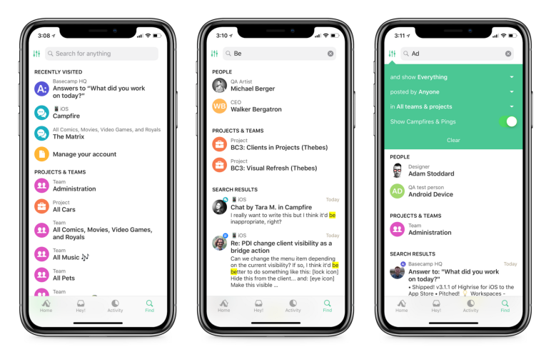
Basecamp 3.9 for iOS includes improvements on the Find tab. When users open the Find tab, they can jump back to anything they have recently viewed. They quickly see their most recently visited pages. Thus, they can get back to what they were viewing. They do not even have to type a word. When they do type something, the tool immediately starts searching for it in their account. What’s more, advanced filters allow them to search for more specific terms.

Faster Project and Team pages
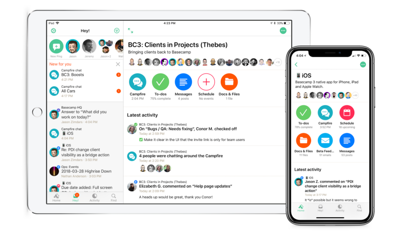
One of the many changes that comes with the latest release is a faster project and team pages. Also, the team’s latest activity appears more prominently. Furthermore, each tool is now represented by a unique icon in bright colors. Previously, they appear as nearly identical cards. Each tool also displays some information beneath it about what is inside the tool. Users report major benefits from this improvement.

Larger Previews in Activity
Another enhancement in Basecamp 3.9 for iOS is the availability of larger image previews in the activity feed. This results in easier interaction with the app. Multiple images in an attachment show up together in a grid. Users can tap any photo from the activity feed and the media viewer will display it. They can also tap into the thread for more details and context.

Simplified Navigation
The latest release also shows a simpler navigation, with the nav bar showing only the project or team name. Along with it is just a button to launch the menu for the user to go to one of its tools. It displays a larger screen title, and every screen has a colored button for adding something new. A simple design is still the best one most of the time.

Additional Options for Uploading Attachments
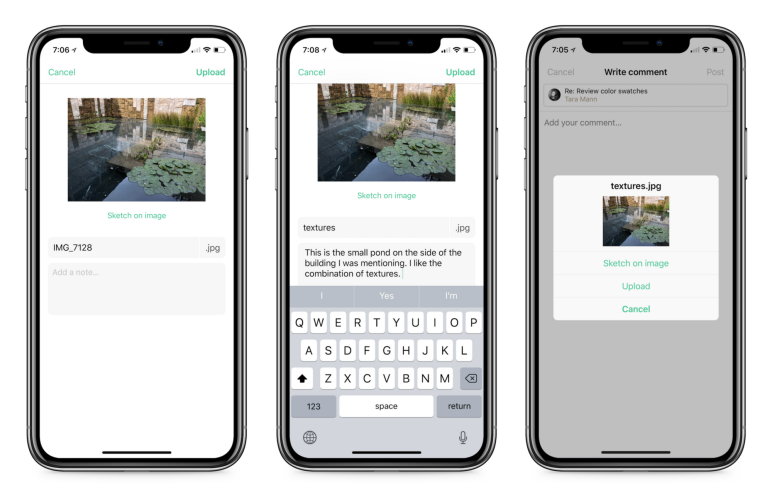
Basecamp 3.9 for iOS also sports a new UI for uploading attachments. Users can experience a larger space to access additional options. For example, when uploading to Docs & Files, they can choose from sketching on the image, adding notes, or renaming the file.

Other Features, Fixes and Improvements
The latest release also comes with bug fixes and performance improvements. For instance, scrolling within a field while writing is smoother. Users can pick from more theme choices, whether a lighter or darker version of the theme color. Some drag and drop issues and missing file type icons were also solved. In addition, the new clients feature that shows which is private to the team and which is visible to the client is now available with the app.

For more information on mobile app updates and other new product features, check the latest news on Twitter, Facebook, Instagram, or YouTube.
Leave A Comment