 Basecamp project management and team communication software is helping more and more companies get a better handle of things. By seeing exactly what needs to be done, teams and organizations have become more efficient in how they accomplish work. At Basecamp itself, employees frequently make presentations, such as mockups or interface design revisions. When presenting before and after screens, they are usually limited to showing only full-width images. Thus, presenting a comparison is difficult, until about a month ago. Now, users can add image galleries to support and enhance their writing. Also available are enhancements on toolbar for images and support for recurring events. For a great reporting and exporting tool for Basecamp, we recommend you use our own tool Bridge24 for Basecamp.
New Side-by-side Image Gallery
Image galleries are great additions to written posts. As they say, a picture is worth a thousand words. Galleries are very useful in sharing screenshots, showing comparisons, presenting mockups, sketches, and photos. Now, it is easy to make a gallery of images to any rich text field in the PM app. Users only have to upload multiple images at the same time. They can do it in a file-browser dialog or by dragging and dropping the images directly. The app will group the images automatically.
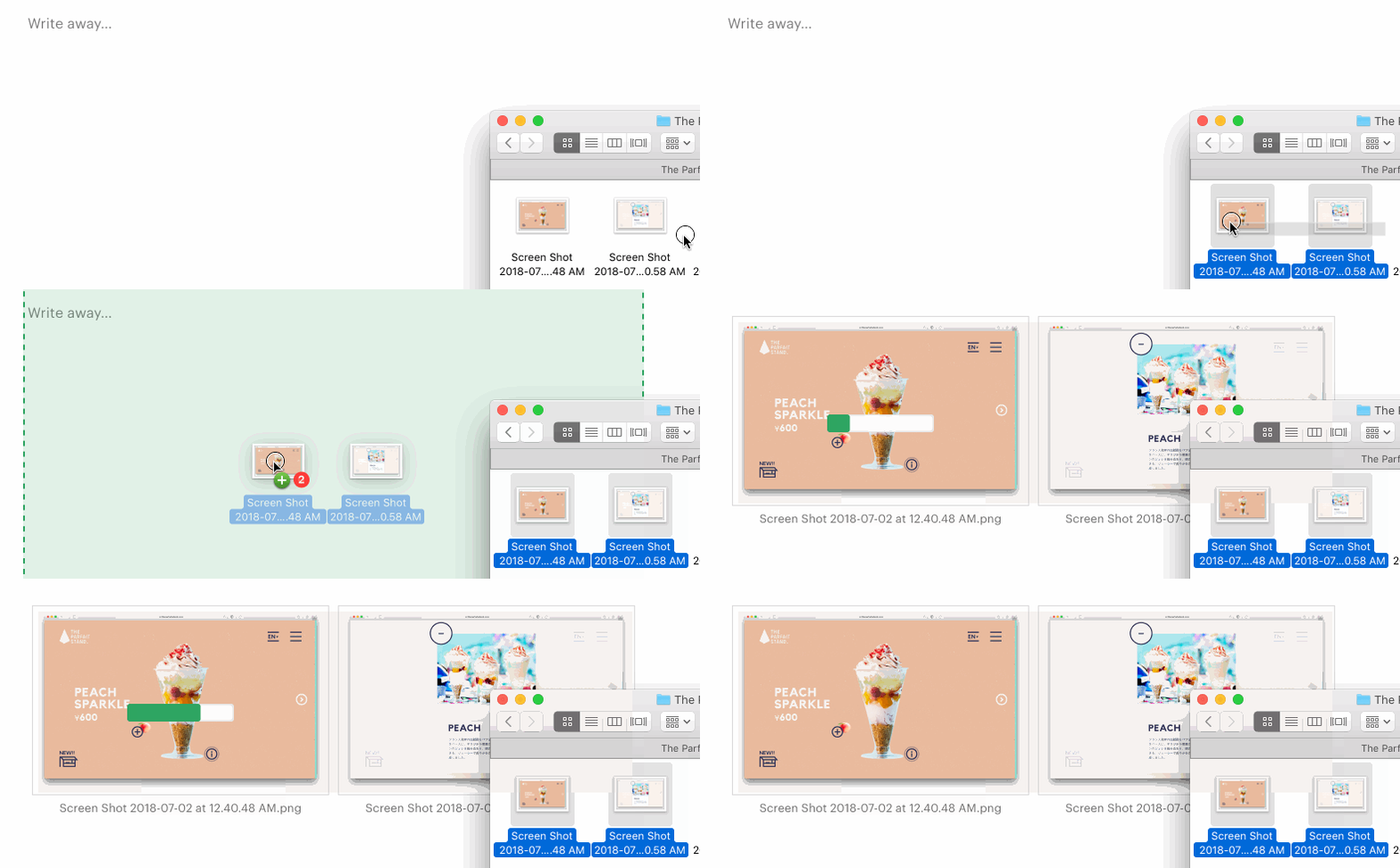
Gallery Layouts
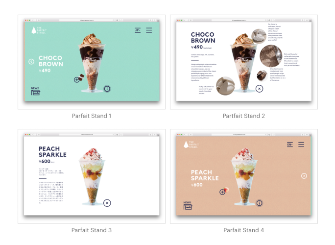
When users upload 2 images at the same time, Basecamp 3 automatically groups the images side by side. When they upload 3 images, they will appear 3-up in a row.

If they upload 4 images, the app will group them in a 2×2 grid.
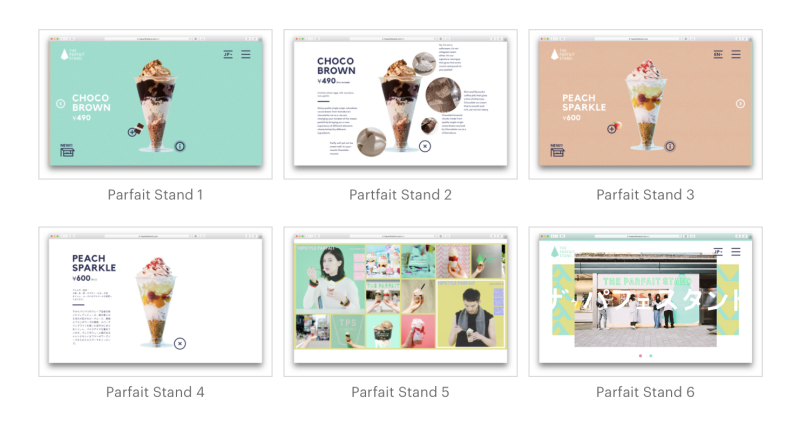
Five or more images will appear in 3-up-sized rows.
Specific Adjustments
Although the PM app automatically groups images in a gallery, users can still make specific adjustments. For example, to split up images in the gallery, they can place the cursor between images and hit the Return button, placing an invisible hard return. For a different order, they can drag and drop the images to reorder their sequence. It is also possible to drag and drop images outside of a gallery inside a gallery, or from the inside out. What users can usually do to pictures in a text editor will work in the same way.
Other Enhancements
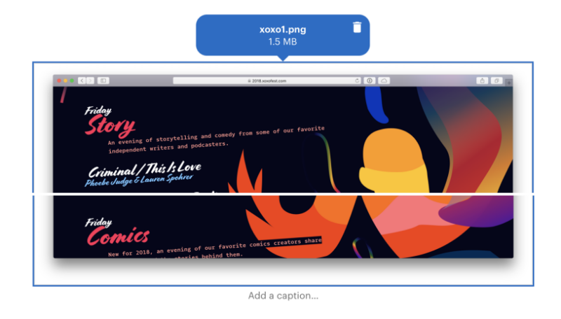
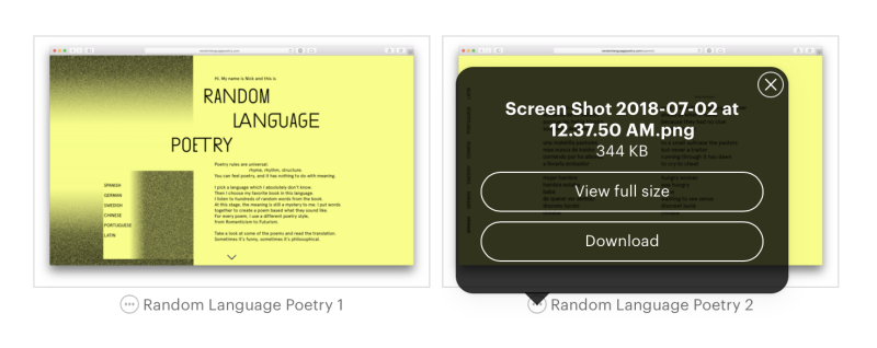
Aside from the new image gallery, Basecamp 3 text editor enhances the toolbar for images. When clicking on attachments, users will see a balloon at the top that shows the trash button as previously, but also the file name and the size of the attachment. Also, clicking on an image will display the ‘Add a caption…’ field at the bottom.
Another useful feature is the presence of the 3 dots (…) menu adjacent to the caption. Clicking this menu will display a popup menu that shows the original file name, file size, and links to view the image in full size, or to download the image.
Recurring Events
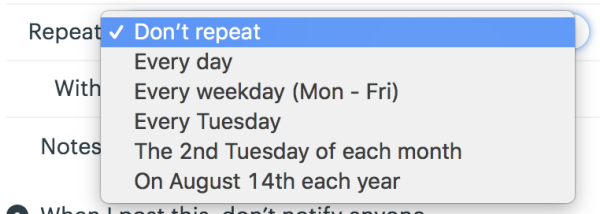
Another Basecamp 3 feature that has been a long time coming but finally available is the recurring events. Users can now add repeating events to their schedule. Whenever they add an event, they will also see an option to repeat the event. They can choose to repeat the event either every day, every week day, once a week, once a month, or once a year.
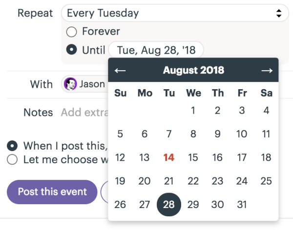
Users can choose to repeat the event forever, or until a certain date. On the event page, the repeat frequency is shown as well.
Available Everywhere For Everyone
Basecamp image gallery features are available in both the desktop and on mobile apps. The recurring events feature is also available for all Basecamp 3 customers on all platforms. To learn more about new features and other product announcements, be sure to check also their Twitter, Facebook, Instagram or YouTube page.
Leave A Comment