 Trello is a visual project management and work organization software used by individuals, teams and large organizations. It is easy enough for all levels of users, flexible for different types of teams and workflows, and free for everybody. It is a popular online tool that is simple on the surface, but also ruggedly reliable. A few months ago, it introduced a design system that aims to provide a more meaningful experience to its millions of users. For a brilliant extension to Trello, we suggest trying out our own tool Bridge24 for Trello.
Reasons For Creating A Design System
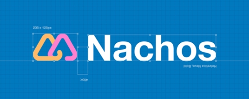
The team behind Trello opted to call their new design system Nachos. The name seems consistent with the application of having an element of fun inside the system. However, there are more serious reasons for having a design system.
The first reason is for consistency. A solid design system as a reference makes it easier for the team to create solutions that show connection and unity. Another reason is alignment. As the team grows, the new and old members can remain on the same direction. Efficiency is another reason. A single design system will consolidate and organize all patterns and UI, and help everyone build, create, and manage efficiently.
Trello Guiding Principles
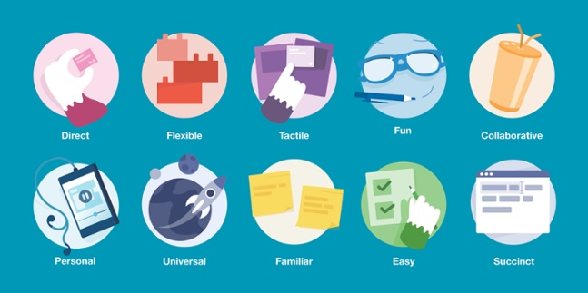
Nachos has helped define and refine the Trello team’s principles. Internally, they can easily feel and understand if something is or is not consistent with the character and characteristics of the software. However, they are not able to describe or explain this when working with external partners or new team members. Working on the design system helped them tackle this difficult task. In return, they were able to come up with a guide that helps people working on the software make the right choices.
A Realignment, Not A Redesign
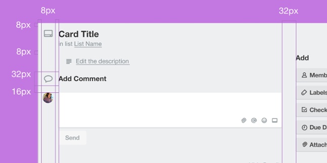
As the team implements Nachos, it has become apparent that improvements are more of a realignment than a redesign. The product is not re-imagined or altered in any major way. The team is working on the product that they already have, while bringing small changes that can create a big impact. One example is the consistent grid that users feel to be there when they launch their boards and display their cards. This structure relays a consistency that holds every element together. It is also an important foundation when making new design choices.
Refining Nachos Design System
Nachos is continuously being worked on as the team reaches out to other partners. A great progress has been made especially on the web product. It will contain new elements soon. They plan also to add documentation around iOS and Android apps. In general, the Nachos guide will be comprehensive in coverage to help give developers a strong tool. Also, organizing the software into components will make it easy for developers. It will be simple to implement the UI into a Power-Up or a flow. As the team continues to build and refine on the design system and share their learnings, it will be straightforward for the others to build upon Trello.
To learn more about Nachos, or other announcements of new features and the latest update, visit Trello also on Facebook, Twitter, or LinkedIn.
Leave A Comment