 Asana team software makes it easier for people to manage projects, track progress, and coordinate work. It also continues to update the software with new tools and functionality to adapt to users’ changing needs. About a week ago, it slowly launched a new Homepage. After logging in, a user will automatically land in his or her Homepage to quickly get back to whatever they are working on. For a powerful reporting and exporting tool for Asana, give our own tool Bridge24 for Asana a try.
Homepage -What is it for?
The new Asana Homepage aims to provide users the first place where they can find specific important projects. A team or Organization may be working on multiple projects, but users are usually working on a few at a time. The Homepage provides an easy access to a list of their Favorite Projects and Projects they have recently worked on. Therefore, with this brand new Homepage, teams can spend less time searching or going back to their work. Instead, they can quickly get back on it and spend time accomplishing what is important.
The Homepage Layout
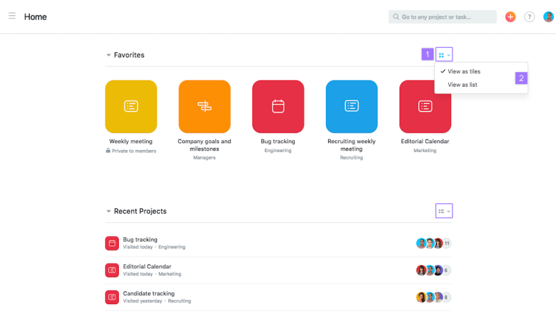
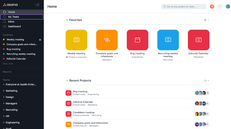
The Homepage link will now be at the top of the list at the left sidebar. On the main page, it displays 2 types of projects. The Favorites are on the upper part, while the Recent Projects are below. The Favorites show as tiles in grid formation. The Recent Projects show as lists. To access a project directly from either group, users can simply click on a tile or a list item. From the Homepage, they will be transferred to the specific project.

How to switch views
The default Asana Homepage view displays Favorites as tiles and Recent Projects as lists. However, users can change this view at any time. They can switch the view of any group and display it either in tiles view or list view. To change a view, (1) first, users should click on the ‘Change view’ icon on the top right of each list. (2) Next, they should select their preferred view, ‘View as tiles’ or ‘View as list’.

Navigating back to My Tasks
Previously, users land on My Tasks as their default view. My Tasks is the page that lists all the tasks that are assigned to a user. With the rollout of Homepage, they need to click a link in order to get back to My Tasks. At the left sidebar, the My Tasks link is usually just below the Homepage link. My Tasks can no longer default as the first view. As a shortcut to getting to it more quickly, they can simply bookmark My Tasks in their respective web browser.

Some community member reactions
The new Asana Homepage got some mixed reactions from community members. A few members questioned the value of the Homepage, stating that it just seems a duplicate of what can be accessed from the side bar. Some prefer having My Tasks as the default view, or enabling the new Homepage to pull some of their tasks for the day. Others are happy about it, allowing them quick access to projects that they need to break up. Still, others are noticing that they see their Homepage at some time, but do not see it in other times.
Just the start
According to Marie, Asana’s Community Forum Manager, they are slowly rolling out Homepage. That can be the reason why some may still not have access to it. The company rolls out the feature by Workspace/Organization, and not by account. Also, the feature is just starting. Eventually, it will be a place that will enable teams to contribute to their project goals more efficiently. It will put upfront anything that needs their attention, and guide them to the right direction at the right time.
To learn more about new features being rolled out, best practices, and other company announcements, visit Asana also on Facebook, Twitter, LinkedIn or YouTube.
Leave A Comment