 Asana collaborative project management application is an advocate of clarity. This inherent characteristic of the software helps teams execute their projects and process quickly and successfully. Change can improve a user’s experience to plan, track and move their work forward. However, it should be clear enough for the users what those changes are, and how they can take advantage of it. Thus, the new user interface navigation changes are slowly and carefully being rolled out to its customers. Changes will be evident in the sidebar, project headers and settings, and other areas. For a powerful reporting and exporting tool for Asana, give our own tool Bridge24 for Asana a try, or access it in their own Integration page.
New in Sidebar
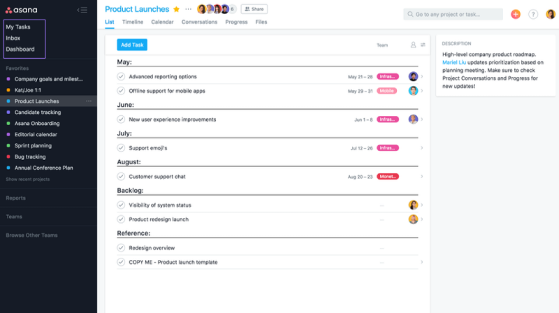
Users will now see My Tasks, Inbox, and Dashboard in the sidebar. It was moved from the top bar. Therefore, it will now be easier for people to know where they are. They will quickly know when they are working out of a project, too. But the easy access to My Tasks and Inbox is still there. Users can exit out of the sidebar by clicking the close (X) button on the top right of the sidebar. If they wish to go back to My Tasks, Inbox, or Dashboard, they just have to click back into the sidebar to access these pages. Another visible change is the list of favorite projects, which are now easier to see.
Project headers
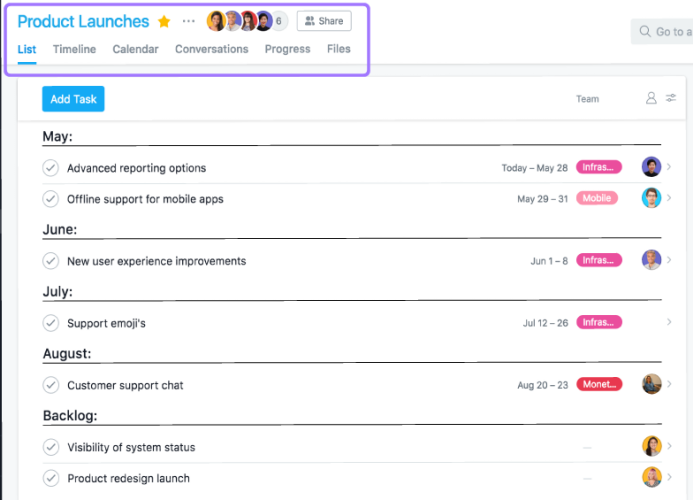
Since My Tasks, Inbox and Dashboard are now in the sidebar, the header at the top bar shows a simpler layout. Asana project names are still visible but smaller. They appear near the top left corner of the top bar. Users can easily see what project they are working out of. They can quickly see the project members and the tabs to find project details.
Project settings
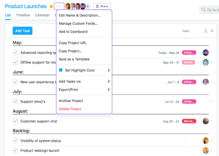
Before, users access the dropdown button after the project name to see the available project actions. Now, they will have to click the three-dot button to access project settings. The dropdown menu will appear to allow the user a variety of available actions. They have options to edit project names and descriptions, manage custom fields, add it to a dashboard, or save it as a template, among others.
Project members
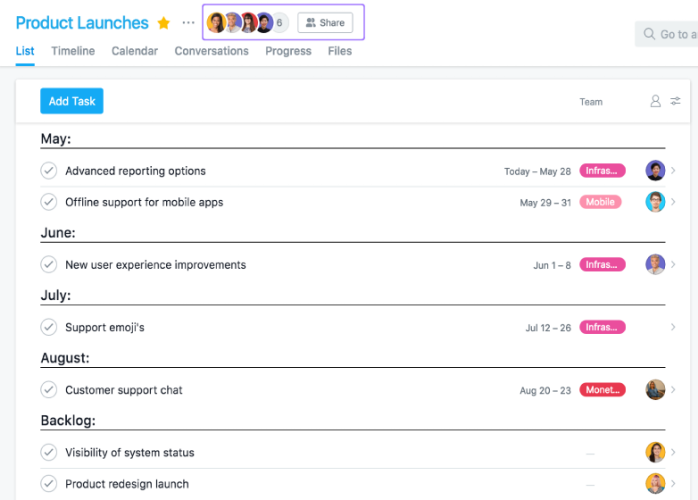
Another visible change is the location of Asana project members. They are now after the project settings button instead of the far top right corner. To add or remove project members, users need to click the avatars of these members. Another way is to click the Share button. They can also control the access and notification settings of project members from these controls.
Search bar and Quick add (+) button
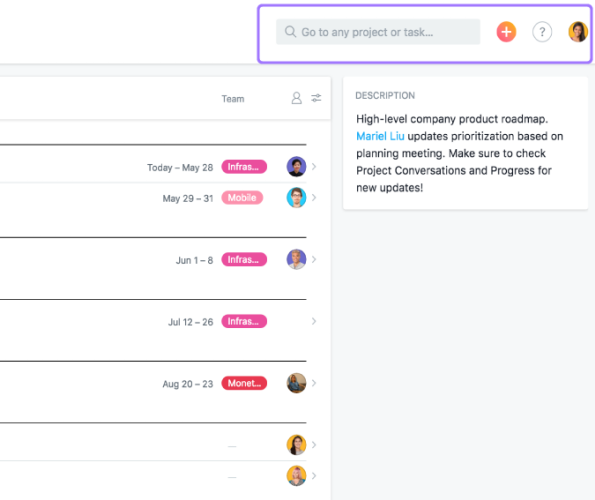
Previously, the search bar and the orange quick add (+) button were near the center of the top bar. Now, they are at the right hand side of the top bar, next to the help menu and user’s avatar. Previously also, the domain name of the user appears before the user’s avatar. It no longer appears in the new UI, but users can still switch between domains by clicking their avatar and choosing another domain.
Team navigation updates
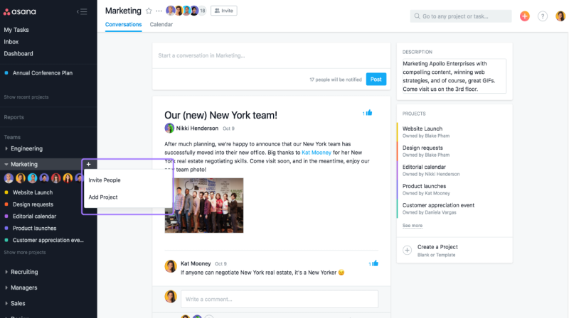
The new UI makes it simpler to view team conversations and team calendar. From the sidebar, users only need to click the team name. Once in the team page, they can navigate between conversations and calendar. They just have to click the proper tab at the top of the page. They can expand the team by clicking on the caret before the team name. This will point down and display the members of the project team in the sidebar. To invite other people into the team or to add a new project, clicking the plus (+) button beside the team name will display the appropriate action menu.
Different look, Same objective
The new Asana UI navigation changes are still in beta, and more customers will get to experience them as time goes on. These changes are minor, but visible enough to make the PM app look different. They will help keep project information closer together, with the objective of keeping project management simpler. To learn more about these new changes and other updates, look out for announcements on their Facebook, Twitter, LinkedIn or YouTube page.
Leave A Comment